Clean_and _eda
Uber dataset in Rusia with Python
This idea is based on replying the exercises from the previous post, but this time I prefered in a different database, this one is for Uber and its operations in Rusia. The dataset is very similar to the other, but in this we do not have the sources and destinations, and it’s considerable small only 677 rows and 25 variables.
This time, we will use only Python to replicate all the exercises from the previous post. In that way, we use the techniques learned in the Course of Machine Learning from A-Z
Let’s begin….
import pandas as pd
import numpy as np

rus = pd.read_csv('E:/Blog/rusia_rides.csv', sep=';')

rus.drop('trip_completed_at', inplace=True, axis=1)
rus.head(10)
Trip end time
import datetime

rus['date'] = [d for d in rus['trip_end_time']]
rus['time'] = [d for d in rus['trip_end_time']]

rus['trip_end_time'] = pd.to_datetime(rus['trip_end_time'])

rus.drop('trip_end_time', inplace=True, axis=1)
Trip start time
rus['trip_time'] = pd.to_datetime(rus['trip_time'])

rus['s_date'] = [d for d in rus['trip_time']]
rus['s_time'] = [d for d in rus['trip_time']]
Converting time
rus['total_time'] = pd.to_datetime(rus['total_time'])
rus['wait_time'] = pd.to_datetime(rus['wait_time'])

rus['total_time'] = [d.time() for d in rus['total_time']]
rus['wait_time'] = [d.time() for d in rus['wait_time']]
Changing the values for gender variable
rus["driver_gender"]= rus["driver_gender"].replace('Male', 1)
rus["driver_gender"]= rus["driver_gender"].replace('Female', 0)
Subsample selection for the following exercises
data = rus[['trip_status', 'ride_hailing_app','trip_time', 'total_time', 'wait_time', 'trip_type',	'surge_multiplier', 'vehicle_make',	'driver_gender', 'trip_map_image_url',
'price_usd', 'distance_kms', 'temperature_value', 'humidity',	'wind_speed',	'cloudness',	'weather_main',	'weather_desc',	'precipitation']]

## save file ----------------------------
data.to_csv(r'rus1.csv', index = None, header=True)

data.head()
data.shape
In the next part, we will realise some basic statistical analysis of the variables.
We must admit that the tasks of loading, cleaning and preparing the database was more easy than in R.
Exploratory data analysis (EDA)
import matplotlib.pyplot as plt
import seaborn as sns
from scipy.stats import norm
from sklearn.preprocessing import StandardScaler
from scipy import stats
import warnings
warnings.filterwarnings('ignore')
%matplotlib inline
from IPython.display import HTML
Summary statistics of price (in $US)
| Stats | Value |
|---|---|
| Mean | 5.061593 |
| std | 4.251843 |
| min | 0.840000 |
| 25% | 2.760000 |
| 50% | 3.735000 |
| 75% | 5.67000 |
| max | 33.550000 |
| count | 678 |
Here’s the price histogram: 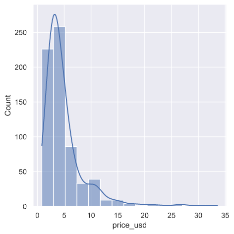
fig, ax1 = plt.subplots()
ax2 = ax1.twinx()
ax1.hist([df['total_time'], df['wait_time']])
n, bins, patches = ax1.hist([df['total_time'], df['wait_time']])
ax1.cla() #clear the axis

#plots the histogram data
width = (bins[1] - bins[0]) * 0.4
bins_shifted = bins + width
ax1.bar(bins[:-1], n[0], width, align='edge', color = 'blue')
ax2.bar(bins_shifted[:-1], n[1], width, align='edge', color='orange')

#finishes the plot
ax1.set_ylabel("Total", color='blue')
ax2.set_ylabel("Wait", color='orange')
ax1.tick_params('y', colors='blue')
ax2.tick_params('y', colors='orange')
plt.tight_layout()
plt.title('Histograms for Total and wait time')
plt.show()
Here’s the price histogram by total and wait time: 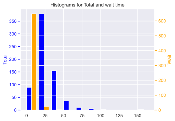
But we could show the relation on a more clear way a scatter plot…
plt.figure(figsize=(8, 5))
ax = plt.subplot(121)
plt.scatter(df['wait_time'], df['price_usd'], color = 'blue', marker='^')
plt.ylabel('price $US', multialignment='center')
plt.title('Wait time and price')
ax = plt.subplot(122)
plt.scatter(df['total_time'], df['price_usd'], color = 'green', marker='*')
plt.ylabel('price $US', multialignment='center')
plt.title('Total time and price')
Here’s the scatter plot of price by total and wait time: 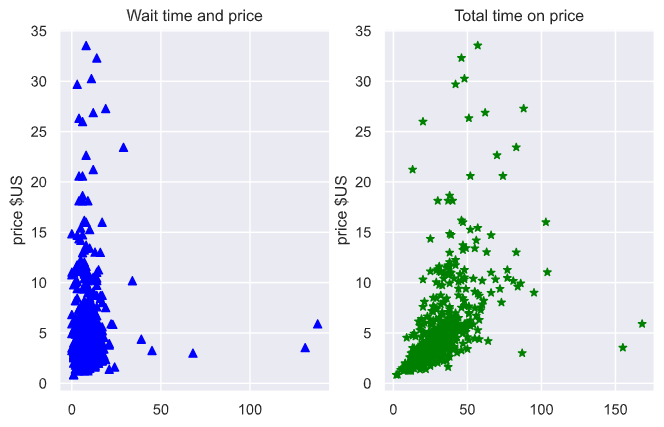
Price by city zone: 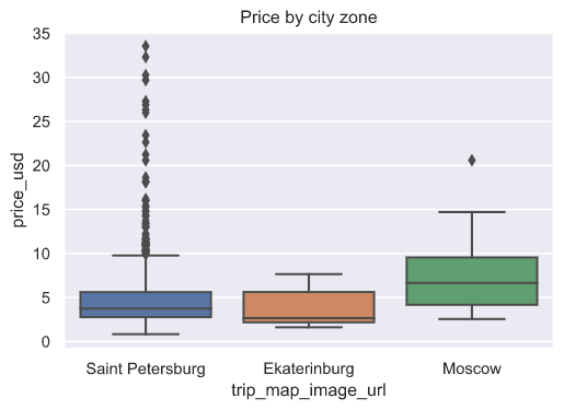
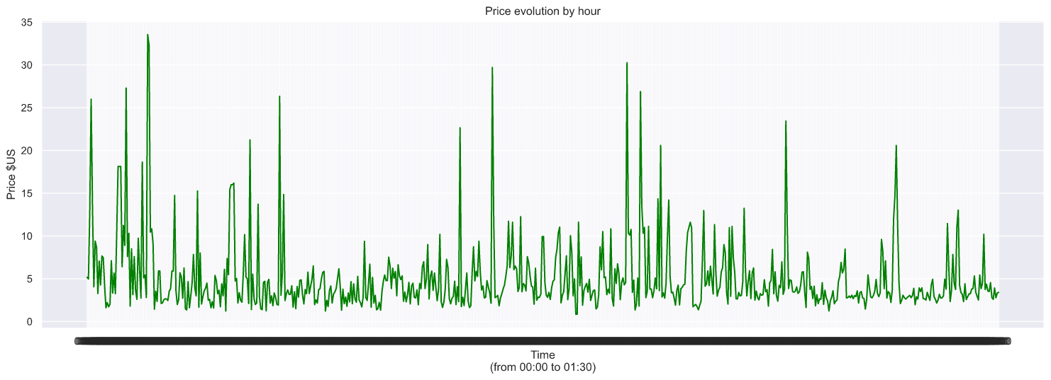
And also we could simulate the evolution of the price.
import dateutil
from datetime import datetime
import matplotlib.dates as md

time = pd.date_range("00:00", "01:30", freq="8S")
time = time.astype('str')

dates = [i.split(' ')[1] for i in time]
dates.insert(1,'00:00:04')
dates.insert(4,'00:00:20')

plt.figure(figsize=(19, 6))
ax=plt.gca()
# ax.set_xticks(dates)

xfmt = md.DateFormatter('%H:%M')
ax.xaxis.set_major_formatter(xfmt)
plt.plot(dates, df['price_usd'], color='green')
plt.title('Price evolution by hour')
plt.xlabel('Time\n(from 00:00 to 01:30)')
plt.ylabel('Price $US', multialignment='center')
plt.show()
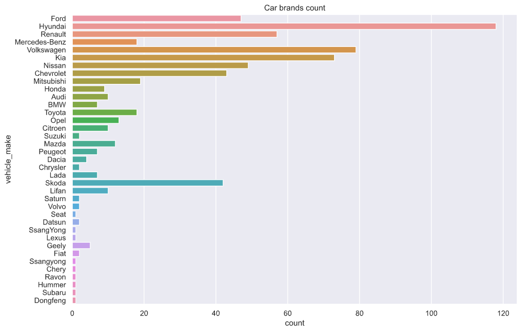
sns.set(rc={'figure.figsize':(12,8)})
sns.countplot(y="vehicle_make", data=df).set_title("Car brands count")
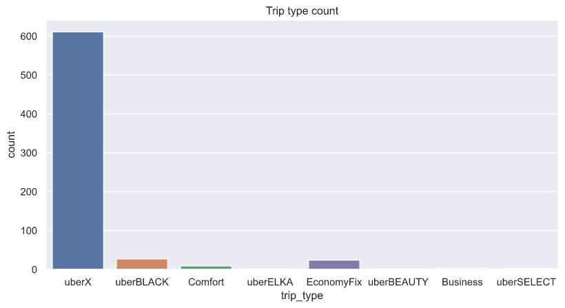
sns.set(rc={'figure.figsize':(10,5)})
sns.countplot(x="trip_type", data=df).set_title("Trip type count")
On the other hand, we could plot a bar chat with the brand of cars used and the type of services provided.
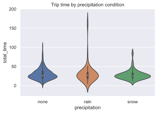
Weather conditions
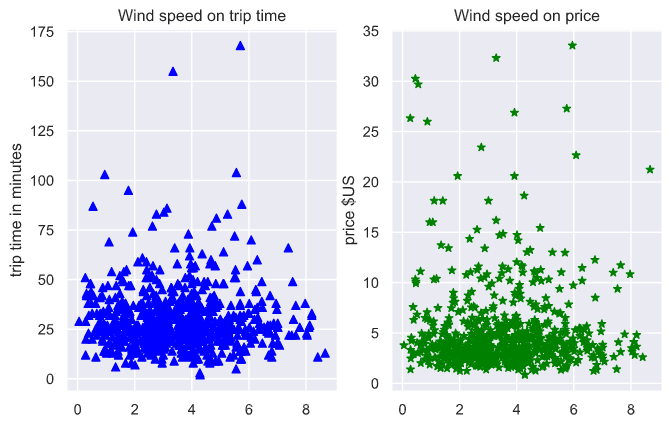
Also we could see how weather conditions affects the trip time.
sns.violinplot(x="precipitation", y="total_time", data=df).set_title("Trip time by precipitation condition")

plt.figure(figsize=(8, 5))
ax = plt.subplot(121)
plt.scatter(df['wind_speed'], df['total_time'], color = 'blue', marker='^')
plt.ylabel('trip time in minutes', multialignment='center')
plt.title('Wind speed on trip time')
ax = plt.subplot(122)
plt.scatter(df['wind_speed'], df['price_usd'], color = 'green', marker='*')
plt.ylabel('price $US', multialignment='center')
plt.title('Wind speed on price')
Next time, we talk about regression: Linear Regression, PLS & PCR, Random Forest, Supported Vector Machines.